We will draw a bar plot to view number of missing values in Ames Housing dataset. For this we need to import seaborn and matplotlib libraries. Lets see how to draw a bar plot representing missing values in the dataset.
Step 1: Load the required libraries
import pandas as pd
import seaborn as sns
import matplotlib.pyplot as plt
Step 2: Load the dataset
dataset = pd.read_csv("C:/datasets/train.csv")
Step 3: Draw a bar plot
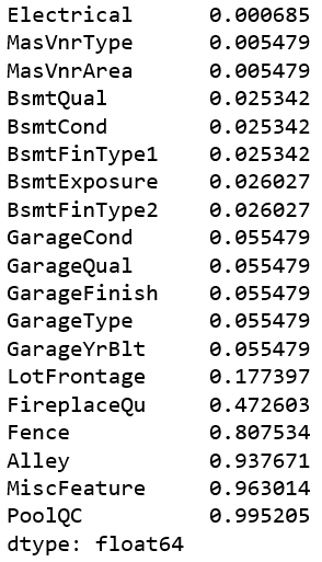
missing_values = dataset.isnull().sum() / len(dataset)
missing_values = missing_values[missing_values > 0]
missing_values.sort_values(inplace=True)
missing_values

Now lets create a pandas dataframe of above result:
missing_values = missing_values.to_frame()
missing_values.columns = ['count']
missing_values.index.names = ['Name']
missing_values['Name'] = miss.index
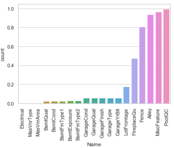
We have created two columns ("Name" and "count") in pandas dataframe. Finally, create a bar plot to represent missing values:
sns.set(style="whitegrid", color_codes=True)
sns.barplot(x = 'Name', y = 'count', data=missing_values)
plt.xticks(rotation = 90)
plt.show()

Step 1: Load the required libraries
import pandas as pd
import seaborn as sns
import matplotlib.pyplot as plt
Step 2: Load the dataset
dataset = pd.read_csv("C:/datasets/train.csv")
Step 3: Draw a bar plot
missing_values = dataset.isnull().sum() / len(dataset)
missing_values = missing_values[missing_values > 0]
missing_values.sort_values(inplace=True)
missing_values
Now lets create a pandas dataframe of above result:
missing_values = missing_values.to_frame()
missing_values.columns = ['count']
missing_values.index.names = ['Name']
missing_values['Name'] = miss.index
We have created two columns ("Name" and "count") in pandas dataframe. Finally, create a bar plot to represent missing values:
sns.set(style="whitegrid", color_codes=True)
sns.barplot(x = 'Name', y = 'count', data=missing_values)
plt.xticks(rotation = 90)
plt.show()
Nice example. It helped in my project
ReplyDelete